Wednesday, November 20, 2013
My Blog!
I have created this blog to list and explain different types of maps! When people hear the word map, they generally do not realize how many kinds of maps there actually are, and how they all differ. This blog explains the differences, and provides pictures and website information.
Correlation Matrix

Source: http://www.hawaii.edu/powerkills/UFA.HTM
Correlation Matrices is used for factor analysis. This allows for data sets to be analyzed and compared, which can help with making predictions of trends and comparisons to historic data. In addition, it allow researches to put their theories to test. The correlation matrix I included shows the values of certain nations on subjects such as trade, power, stability, U.S. agreement, and percentage of GNP for defense.
Star Plots

Source: http://assessment.tki.org.nz/Assessment-tools-resources/Alignment-of-tools-with-National-Standards/Reading/Observation-Survey
Star plots are a more complex graph. The information they depict has multiple variables, and is spread across a 2D chart. In today's society they are commonly seen being used in sports to chart the players strengths, weaknesses, and overall performance on the team. Visually, they make it simple to view any outliers. This chart above represents reading achievement. The things that affect it most are letter identification- since the lines are the highest at the point.
Similarity Matrix

Source: http://www.calculatebmi.co/bmi-calculator-for-men/
A similarity matrix is a tool for comparison of numbers representing different data. The best example of this is a BMI chart. It takes two separate sets of data- Height and Weight, and compares the two and shows where the match up to represent someone who is underweight, healthy, overweight, obese, and extremely obese. Similarity matrices have 3 columns- the original 2 that are being compared, and the third is the column which presents the outcomes. This chart utilizes colors to show the comparison between the numbers and which area they correspond with. Green is the zone which everyone should be in, because that represents a healthy individual. Taller people can weigh more and still be healthy.
Stem and Leaf Plot

Source: http://www.basic-mathematics.com/stem-and-leaf-plot.html
Stem and Leaf plots categorize data in numeric order. A vertical line is used to separate the numbers from their origin. For instance, the first number in the stem column is 10, which represents 100. The numbers to the right, or the leaves, consist of 4 and 7. Together these numbers represent 104 and 107. This is an easy way to look at a collection of data with similar number values, and not have to worry about looking at their columns and where they line up on the graph. This is a much quicker way of interpreting the data and discovering things such as the mean, median, and mode.
Box Plot

Source: http://www.itl.nist.gov/div898/handbook/eda/section3/boxplot.htm
Box plots are used for two main purposes: to convey location of data and to convey the variation of data. This can be done by finding the mean of the data and plotting that value and its quartiles. This box plot is displaying different machines energy output. These plots are able to identify the overall mean, extreme points, or outliers, and the median.
Histogram

Source: http://quarknet.fnal.gov/toolkits/ati/histograms.html
Histograms are bar graphs that show frequency distributions. This graph above is from this set of numbers: 1,2,2,3,3,3,3,4,4,5,6. The x-axis which is the 'number in set' is numbered 0-6. The y-axis is the 'times appearing', which is numbered 0-5. This is a simple representation of a histogram, because it records the frequency of numbers appearing in a number sequence. Judging by the graph, the number 3 appears 4 time, while the number 1, 5, and 6 only appear 1 time. The numbers 2 and 4 appear 2 times.
Parallel Coordinate Graph

Source: http://www.juiceanalytics.com/writing/parallel-coordinates/
Parallel Coordinate Graphs display different data across multiple dimensions. They seem a bit confusing, but when can be an easily visual when trying to interpret data and statistics. The graph I have chosen is a much more simple example. It has two baseball players- Carlos Pena, and Albert Pujols. The data that is presented on this graph is their percentage of being on-base, power, base running, and fielding.
Triangular Plot

Source: http://csmres.jmu.edu/geollab/fichter/SedRx/readternary.html
Triangular Plots are slightly different than other graphs. When I look at them I can't help but think of the map key on unclassed choropleth maps. The triangular plots have 3 corners and each of the corners represents something different. In this example, the 3 corners are sandstone, limestone, and shale. Any data that is not completely in 1 corner is closer to the center. In this case that would mean it is not compose solely of limestone, but maybe contains some shale. While this is similar to unclassed choropleth maps- in that their values are not a range, these graphs do provide numbers to their data.
Windrose

Source: http://www.wcc.nrcs.usda.gov/climate/windrose.html
A Windrose is utilized by meteorologists to map wind speeds and the direction of their travel in specific areas. They show the winds frequency from where they are coming from. The length of the colored lines on the Windrose shows the frequency of them traveling from that location. This map from California shows that most of their winds head in the North West direction. Very few head in other directions.
Climograph

Source: http://www4.uwsp.edu/geo/faculty/ritter/glossary/A_D/climograph.html
Climographs show the average monthly weather conditions for a specific location. This graph includes the monthly averages for the entire year. It also includes the average precipitation and average temperature. January had the most rain in Memphis, while July had the hottest temperature. These maps are similar to bilateral graphs, since they allow for comparison.
Population Profile

Source: http://www.co.nezperce.id.us/Departments/PlanningandBuilding/ComprehensivePlan/ComprehensivePlanHomePage/Population.aspx
Population profiles show the gender make up of a population at a certain time. As you can see here, in 1990, the majority of the population in the U.S. was 25-34 years old. Right below that is 35-44 years old. The smallest amount of the population at that time was 20-24 years old. In 1970, the majority of the population was still the same age, however, the population wasn't as large.
Scatterplot

Source: http://forrest.psych.unc.edu/research/vista-frames/help/lecturenotes/lecture11/overview.html
Scatterplots are graphs that show the relationship between two variables. They allow for comparison and analysis on how the two variable affect each other. I chose a scatterplot that compares GPA's with SAT math scores. Looking at the scatterplot, it is apparent that students with higher GPA's scored better on their math portion of the SAT. Students with average GPA's did average on the math portion of the SAT, while students with lower GPA, scored lower- in the 300-400 range.
Index Value Plot

Source: http://waterwatch.usgs.gov/new/index.php?r=&m=real&w=plot
Index Value Plots are used to compare data to a preset, or historical data, and analyze trends. In this plot, The United States streamflow is being compared to years past. The line in the center of this plot is the 'normal' streamflow. A 7 is considered 'wet', and a '1' is considered dry. The data fluctuates from 1999 to 2013 and we are able to see how it changes each year. Some years are much lower than others- 2011, and some are much higher than others- 2005. Overall, it stays close to the 'normal' line, and there are not any outliers.
Bilateral Graph

Source: http://www.scielo.br/scielo.php?pid=S1808-86942011000500008&script=sci_arttext
Bilateral graphs are any type of graph that incorporates 2 different sets of results. Generally, they aer both there for comparison. They can be anywhere from line graphs to bar graphs. Both are capable of portraying and comparing information. I have chosen a bar graph that is from a scientific study.
Accumulative Line Graph or Lorenz Curve

Source: http://ingrimayne.com/econ/AllocatingRationing/MeasuringIncomeDist.html
Accumulative Line Graphs, or Lorenz Curves, show distribution. It can show distribution of things such as income and wealth. I have included a Lorenz Curve which show the distribution of income. It compares the percentage of income to the percentage of households. The blue line represents the line of equality- where 10% of households would be making 10% of the income and so on. The Lorenz curve shows where the distribution is- in this case less than 60% of the households making 20% of the income.
Nominal Area Choropleth Maps
.jpg)
Source: http://www.mapsofworld.com/map-of-countries.html
Nominal Area Choropleth map are similar to other maps that use colors to represent data. However, this type of map does not have an order, because it is nominal. That is why many of these maps can use multiple colors. They are representing non-numerical data, so the color distinction is not important.
The map I have chosen is a map of the world with the countries all in different colors. These colors separate the countries, but they do not represent anything else- i.e. population.
Unstandardized Choropleth Maps

Source: http://chandoo.org/wp/2009/07/24/medicare-chart-critique/
Unstandardized Choropleth maps are different because they are unable to to compared. They do not use a standardized measurement when displaying their data. For example, the map I have included is the health care costs for the U.S. It does not compare it to the population in the area, so the numbers are not able to be compared. In that sense they are meaningless. The map I posted for Standardized Choropleth maps is different because it posted the data and compared it to the county populations. It was then standardized, unlike this map of health care costs.
Standardized Choropleth Maps

Source: http://www.missourieconomy.org/newsletter/hispanic_pop2008.html
Standardized Choropleth maps allow for comparison because they are all the same- or standardized. This map is the hispanic population in the different counties of Missouri. They each have been averaged, as opposed to a population number. That way, the smaller counties can be compared to the larger counties and vise versa.
Univariate Choropleth Maps

Source: http://www.colocarto.com/custom-thematic-maps.html
Univariate Choropleth maps are opposite of bivariate choropleth maps. These maps represent the data of a single research topic. The map I had chosen is representing the est. Median Household Income from 2008. The key has several shades of red, yet they all have a interval range, unlike the unclassed choropleth maps.
Bivariate Choropleth Maps

Source: http://proceedings.esri.com/library/userconf/proc99/proceed/papers/pap171/p171.htm
A Bivariate Choropleth map is similar to the choropleth map, except it represents two values. The prefix 'bi' meaning two, helps to explain what it entails. This map I have chosen uses the dots as well, which are sized based on their range. However, there are two different color dots, each representing something separate. It is easier to interpret what the map states, since the dots are on top of one another, allowing us to see the size difference.
Unclassed Choropleth Maps

Unclassed Choropleth Maps are similar to classed choropleth maps, except they do not have classes. As you can see from the key on this map, it is just the color spectrum. The map I chose is representing the republican and democratic votes from the 2008 Presidential Election. These maps are more accurate, because they are not classified by a range, but an actual number. That is why the map appears to be purple, it is not simple 'red' or 'blue', but it goes to shades in between to match the number it is representing.
Classed Choropleth Maps

Classed Choropleth Maps are similar to choropleth maps, except these are divided into classes. There are a few things that can determine how to create the intervals on the map. They include equal steps, natural breaks, and quantities. As you can see from the images I have included, A map with only 4 classes is harder to distinguish than a map with 11 classes. The map I have chosen is a In terms of this map, classes help to distinguish the shading of the color, and lessen the range of the interval, which allows for a better interpretation of the value.
Range Graded Proportional Circle Map

Source: http://www.e-cartouche.ch/content_reg/cartouche/cartdesign/en/html/ThemMaps_ThemData.html
Range Graded Proportional Circle Maps are very similar to the other proportional circle maps. These maps use the circles to represent data, and vary in size depending on their numerical data, however, when these maps are created, there is a set number of dots that will be used. This map above is presenting the population of the Communes in the Region of Zurich. The dots all have set values, and in this case, they are not equal intervals.
Continuously Variable Proportional Circle Map

Source: https://www.e-education.psu.edu/geog486/book/export/html/1796
Continuous Variable Proportional Circle Maps use dots as distribution and size them based on their numeric value. This is very similar to Proportional Circle Maps, except these represent more data. For instance, the map I have chosen incorporates the amount of different meats that were shipped to butcheries in different parts of Paris. So, in whole, the larger dots represent a larger amount of meat sent to that butcher, but the colors within the circles represent different types of meat.
DOQQ
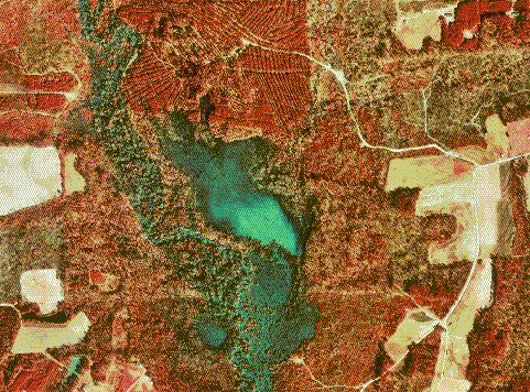
Source: http://www.lib.ncsu.edu/gis/doqq.html
DOQQ is an acronym for Digital Orthophoto Quarter Quads. They are basically aerial photos that have a resolution of 1 meter. They are orthorectified, which means that they have the distortion from the aerial view removed. There are both infrared DOQQ and black and white DOQQ. I have selected a infrared DOQQ, which is an aerial view of North Carolina in Johnston County. Along with DLG, these images are produced by the USGS.
DEM

DEM, is another acronym for Digital Elevation Models. These are able to show the elevation of areas over the bare earth. Similar to contour on the Isoline maps, the closer the lines are on the map, the more change that happens in those areas, meaning the more detailed the model will be. DEM can be used for several purposes. They can be used for 3D graphics and for making relief maps. It is important that these are very accurate maps.
DLG

Source: http://www.dnr.sc.gov/GIS/descdlg.html
DLG, or Digital Line Graphs, are digital images of topographical maps. These maps are provided by the U.S. Geological Survey. The scales which are generally used are 1:24,000 and 1:100,000. I have incorporated a digital line graph from Beaufort, SC. As you can see by the map, it is fairly blank, but rather has horizontal outlines, similar to the planimetric map I posted earlier on my blog. DLG have 3 different scales- large, intermediate, and small. These can show anything from airports, to roadways.
DRG

Source: http://www.lib.ncsu.edu/gis/drg.html
DRG is an acronym for Digital Raster Graphics. These maps are scanned topographic maps & topographic maps only! They are also georeferenced. DRG must be be scanned at a minimum of 250 dots per inch. These dots are in this format because they are projected to the UTM, or Universal Transverse Mercator.
The map I have included in this post is of North Carolina State University. It is on a small grid displaying the campus of the school.
Isopleths

Isopleths are maps have too, have contour lines drawn through to measure equal data. This map is a Isopleth map that represents the Hydrogen Ion concentration as pH from measurements made at the field laboratories in 1998. The scale states that red is < 4.3 level and green is >5.3. That being said, the east, which is mostly red has a lower lever than the west, which is green.
Isopach

Source: http://www.kgs.ku.edu/Publications/Oil/primer08.html
Isopach maps are maps that use lines to connect dots in areas of equal rock thickness. Places all over the world have different land make-up and not all places have equal thickness of their ground. The map I have included is an image of contour lines on a isopach map showing areas of greater thickness than others. Like the other Isoline maps, when the lines are closer, there is more of a change in numeric data in that area. I chose this image because it gives a 3D side view to get an idea of what the lines are showing. This image from an aerial view looks like lines running in circles, yet when from the side you can see the make-up of the area, and which parts are higher, or in this case, thicker.
Isohyets

Source: http://www.scoop.co.nz/stories/AK0808/S00090.htm
Isohyets are maps with lines connecting points that share the same amount of rainfall. These maps are able to tell us the intensity of rain in different areas, and the distribution of it across our country. These lines do not show daily rainfall, but they do show monthly. In addition, they can show yearly rainfall. The map I have included has lines that are very close together, indicating change in the amount of rainfall for that area, and lines that are spread out, indicating that there is not much change in that area.
Isotachs

Source: http://stresscretegroup.com/technical-resources/wind-maps/american-isotach-wind-map.asp
Much like the other types of maps beginning with the prefix 'iso', Isotachs connect lines with places of equal numeric value. However, these lines connect to areas with equal wind speeds. The image I have included is an image of the U.S. with isotachs lines running across the North East and the South East. The lines appear to be close together, which means that numeric value is not representing a larger area. It means that the numbers change rapidly, and change as they moves across different areas in these states. As you can see, Florida has 45- 67 mph winds.
Isobars

Source: http://www.nc-climate.ncsu.edu/edu/k12/.IsobarIsotherm
Isobars are a type of Isoline map. The prefix 'iso' means equal. These maps have lines that connect areas of equal atmospheric pressure. They can point out ares on our weather maps with high and low pressures. They can also tell us how intense the weather system is. On the weather reports, there is often an 'H' for high pressure system, and an 'L' for a low pressure system. Low pressure areas will generally experience rainfall, while high pressure areas will experience a clear day.
The map I have chosen is of some low and high pressure systems across the U.S. and into the Gulf area. Areas that would experience rain in this system would be Northern Texas, and Southern California. Michigan would be experiencing ideal sunny weather.
LIDAR

LIDAR stands for LIGHT DETECTION AND RANGING. Scientists use LIDAR devices by attaching them to the bottom of aircrafts and flying over the area which they are studying. These devices work with a GPS receiver to create maps that are 3D. This is different from radar because radar devices send off radio waves. LIDAR sends off laser lights. LIDAR has been used since the 1960's, much like the rest of our technology, has been advancing over years.
The map I have included is of St. John, U.S Virgin Islands. It has created a topographic map of the area.
Doppler Radar

Source: http://www.spc.noaa.gov/faq/tornado/doppler.htm
Doppler Radar is an important weather tool that our nation uses now that gives us an advantage at predicting and preparing for changes in our weather. It can tell us how fast a storm is moving into an area, and the strengths of winds. Christian Doppler is credited with discovering the "Doppler Effect", which is a change in frequency- which can be detected by our Doppler Radar System. This is something that is very common and is seen on all weather reports. The image I have included is of Oklahoma and it is showing an F5 tornado.
Black & White Aerial Photo

Source: https://www.fas.org/irp/imint/docs/rst/Sect10/Sect10_1.html
Black and White aerial photography has many advantages as satellite based imaging. They have many advantages over photos taken without using satellite technology, allowing us to see images that were before unattainable. In this image, it is easy to see a river, streets, and buildings. If this were infrared we would be able to discover more information about perhaps the land itself, but this image gives us a better idea of what is actually there, as opposed to the condition it is in. This photos scale is 1:100,000.
Infrared Aerial Photo

Source: http://www.geomart.com/products/aerial/cir.htm
Infrared Aerial Photos require a chemical emulsion to be applied to the film to create an image that is unique. These images can be used to identify changes over time, or even the health of Earth's vegetation. In this image, heathy vegetation is seen in areas of dark red, while unhealthy is lighter red, or a blue color. The aerial view helps to show what is happening on the surface of our Earth. Infrared can be sensitive to certain light. They require a special attention, however, with this special attention comes valuable information that cannot be seen in black and white, or colored photos.
The map I have included is an infrared photo from NASA, of New Orleans. Looking at the image, it is apparent that not all of their land is very healthy.
Cartographic Animations

Source: http://www.baynews9.com/content/news/baynews9/news/article.html/content/news/articles/bn9/2013/10/7/tampa_bay_history_ce.html
Video:
http://www.baynews9.com/content/news/baynews9/video.html?clip=http://static.baynews9.com/newsvideo/bn9/web_video/OTT_Maps_107.f4v&vtitle=All%20about%20the%20exhibit%3A%20500%20years%20of%20Florida%20Maps
Cartographic animations are used to display change over a period of time. Their display evolves as time passes, and notes the changes that occurred during that time. I chose to use this article and image as an example because I felt it is a great current event that displays cartographic animation. Generally, when people think of cartographic animation, they immediately think of the weather reports. This example is from an exhibit that opened on September 21, 2013, and will be open until February 16, 2014. It displays 500 years over the span of 150 maps, showing how Florida has progressed since the arrival of Ponce De Leon in 1513.
NOTE: The image below that I have included is only 1 of 150 maps recently used to depict the cartography of Florida. Watch the Video link for more information on this Bay News 9 report.

Statistical Maps

Source: http://www.halcrow.com/maps/products/mapping/statistical_map.htm
Statistical maps use colors and shapes to represent numerical data. There are 3 types of statistical maps, which we have already covered in this blog- choropleth maps, proportional circle maps, and dot distribution maps. The map above is an example of a choropleth statistical map. It uses different values of the color blue to represent the percentage of participation in school districts in New York City.
This map helps to visualize how many participants there were in different areas, and in this case, how affective their Common Cents Penny Harvest fundraiser was. In addition, the map key on this example has equal intervals.
Cartograms

Source: http://www.brainpickings.org/index.php/2010/04/15/cartograms/
Cartograms can come in all shapes and sizes. These maps are not based off of actual land size. They are created to show non-geographic areas, but rather represent other information about the world including, population, politics and religion. This map that I have included is a cartogram of the world based off of population. This map shows how overpopulated some countries are. China and India are much larger than they actually are, showing how much more populated these countries are compared to Russia right above them which is barely visible.
Isoline Maps

Source: http://www.ux1.eiu.edu/~cfjps/1400/chapter3.html
Isoline maps utilize lines to show areas of equal value. Their lines connect, and can represent anything from the temperature, to the average rainfall. They are very similar to contour lines, which are used to describe elevation. Isolines are never allowed to intersect because that would mean a line is representing more than one value. If the isolines are closer together, it is apparent that there are changes in numeric value taking place in a small area. For instance, this Isoline map is of the weather in the U.S. The lines are fairly spread out, but if they were closer we would know that the weather fluctuates in different states. I chose this map because I think it is an easy way to interpret what an Isoline map truly looks like. It is not very complicated which allows for a better understanding.
Tuesday, November 19, 2013
Proportional Circle Maps

Source: https://www.e-education.psu.edu/natureofgeoinfo/book/export/html/1553
Proportional circle maps are similar to dot distribution maps, however, instead of multiple dots in certain locations, these maps use one dot sized according to their numeric value. In this map, the state of California has the largest dot, representing Hispanic population of 10,000,000. This is much easier to determine than the state having 10,000,000 small dots on the map. Other states have much smaller dots, meaning the state as a whole has a lower population of hispanics. These maps have a much more simplistic look, with the dot located in the center of the area which it represents.
Choropleth Maps

Source: http://my.ilstu.edu/~jrcarter/Geo204/Choro/Tom/
Choropleth maps use color shades to display quantitave information. The scale helps to distinguish intensity of the data it is presenting. On this map, dark green represents higher percentages of Hispanics in different cities in Florida. Miami is one of this cities on this map where 35.7-57.3 percent of the population are hispanic. Other cities, such as Tampa, have a much lower percentage of 4.1-7.5. It is best for Choropleth maps to use shading, rather than colors of the rainbow (such as hypsometric maps), because it is a better representation of value.
Dot Distribution Maps

Source: http://www-personal.umich.edu/~sarhaus/dotdensity.html
Dot distribution maps utilize dots to show quantities of sorts. They can be placed to represent exact locations, or just as a part of a quantity. Judging by the clusters on this map, the dots appear in exact location, since they are not equally distributed amongst the states. Dot distribution maps can represent just about anything. When I view this image, I cannot help but think of the Verizon Wireless commercial where they display dot distribution maps to showcase their coverage across the U.S.
Verizon Wireless Commercial Link: http://www.youtube.com/watch?v=oQLcC2-Z6VU
Flow Maps

Source: http://graphics.stanford.edu/papers/flow_map_layout/
Flow maps are used to show movement from one location to another. They can show anything from population movements over years, to products and where they ship. They are beneficial because they are not as cluttered and can be much easier to interpret. There is not as much to see and get distracted by.
The map I have included shows migration from California from 1995-2000. This map is focusing on the movement of individuals to different states from California, and where they moved to. Most people moved to the North East, mainly the New York area.
Propaganda Maps

Source: http://kuoest.wordpress.com/
Propaganda maps rely solely on distortion. They are a cartographic interpretation of individuals ideals and opinions. Often they relate to societal or political ideologies. This Propaganda map was created based on the views of Ronal Reagan during the Cold War. As you can see, humor is incorporated into these maps, along with some reality. The compass gives away the main idea here, with West labeled "ours" and the East labeled "theirs". To some, this can be considered malicious. Not everything stated here is true, and parts of it can be interpreted as offensive.
Mental Maps

Source: http://groups.ischool.berkeley.edu/mentalmaps/
Mental maps are unlike all other maps. They are not accurate because they do not display information based off of how it appears. All maps have certain inaccuracies, and are biased since they are based off of the map maker. However, most maps are not created by memory and based off of certain visual reminders.
Mental maps are created by the individuals interpretations of areas based off of their experience. Instead of making a map to scale, the individual may remember certain markers to give them indication of distance. All maps have certain inaccuracies. The map above that I have chosen is someones mental map of their neighborhood. It is clearly not very descriptive and is lacking in certain areas where there are question marks. However, this is how that person visualizes that area and how they remember where certain things are located.
Hypsometric Maps

Source: http://www.acsu.buffalo.edu/~dbertuca/maps/cat/map-portion-images.html
Hypsometric maps are similar to topographic maps, since they both use contour lines to show elevation. In addition, they can use colors and shading. The map above is a great example of colors utilized to describe land. The red areas are of much higher elevation that the flat areas in the light green color. These colors filled between the contour lines give an illustration of the land without seeing an actual aerial view.
PLSS Maps

Source: http://nationalatlas.gov/articles/boundaries/a_plss.html
The PLSS Map stands for The Public Land Survey System. These maps subdivide land in the U.S. It divides the public domain lands- lands that are owned by the Federal Government. Not all states are included in the Public Land Survey System. There are 30 states in total that are included, and the rest rely on the metes-and-bounds system. It began after The Revolutionary War, with the 13 original states. Land began being surveyed in order to sell it. In addition, soldiers were given land for their service to our country. There was no way to determine what land was given to soldiers and what land was being sold by our government without the Public Land Survey System.
The map I have included above is a great example of how land is divided amongst the state of Ohio. I chose to include a map of an individual state, rather than the U.S. as a whole to give a better understanding. This map is an early depiction of the states boundaries- before the Public Land Survey System was fully developed.
Subscribe to:
Posts (Atom)